“Due Palme is an established client of ours,” says Fabio Barnaba, CEO of design house GFC Associati. “They entrusted us with completely restyling the labels for their flagship line, which consists of three of the most flavourful and prestigious red wines: Selvarossa, 1943 andEttamiano.”
“We wanted to restyle the labels in a way that would tell the story of the wine as a unique taste experience with real passion - and with all of the Italian sophistication and elegance,” adds Piero Narcisi, Art Director at GFC Associati. “We paid attention to every tiny detail in design and explored different printing techniques to highlight the precious nature of these wines.”
The printing company Imoco helped find the best material for the highly sophisticated labels.
“We selected UPM Raflatac’s Super Embossed Aluminium label face as the foundation,” says Luca Moretto, Manager of the Adhesive Division at Imoco spa. “The combination of this refined label material and our printing processes brought this distinctive label to life.”
Unique and sophisticated
Cantine Due Palme’s president Angelo Maci has led the largest cooperative in the Puglia region for the past 27 years. The cooperative of 1200 members is among the most distinguished in southern Italy. He considered it vital to incorporate the fundamental elements of wine production into the label design, such as that all-Italian fascination with oenology and the strength and passion of a land historically well-acquainted with the struggle for identity. The result of the four-way collaboration more than answers Maci’s high expectations:
“Our most precious treasure is wine,” he says. “These labels tell the great story of the love, passion and tradition found in every bottle, narrating this in a way that’s both stylish and unique.”
“Uniqueness may well be the thread that ties the Due Palme story together,” sums up Sales Manager for UPM Raflatac Dario Santilli. “This authenticity is captured on an engagingly tactile label which offers a highly sophisticated visual experience.”
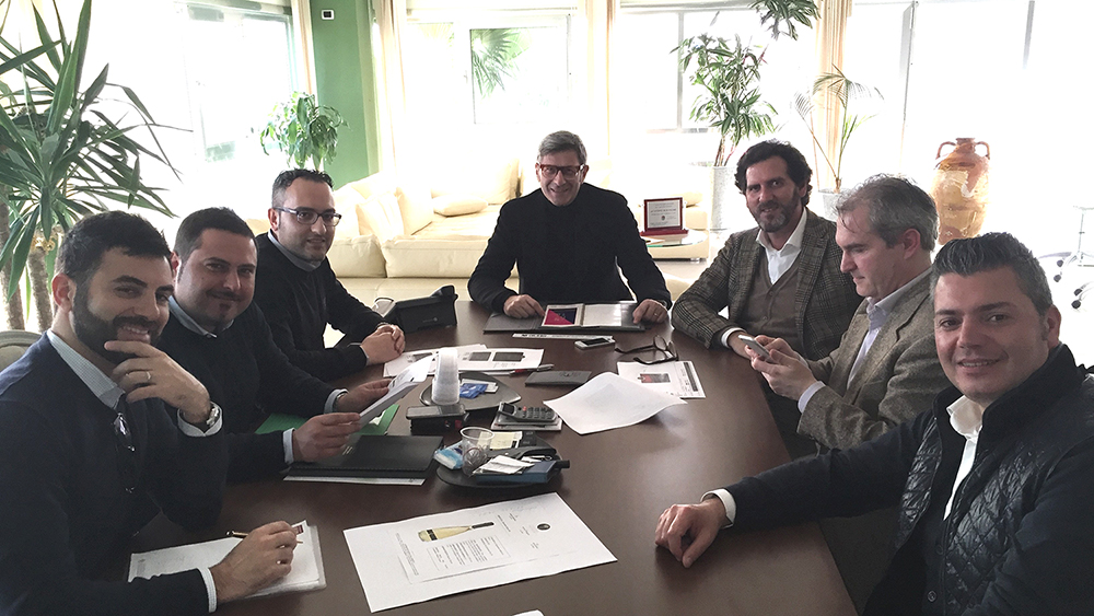 From left to right: Dario Santilli from UPM Raflatac together with representatives from Due Palme, design studio GFC Associati and printing house Imoco.