TAKEAWAYS
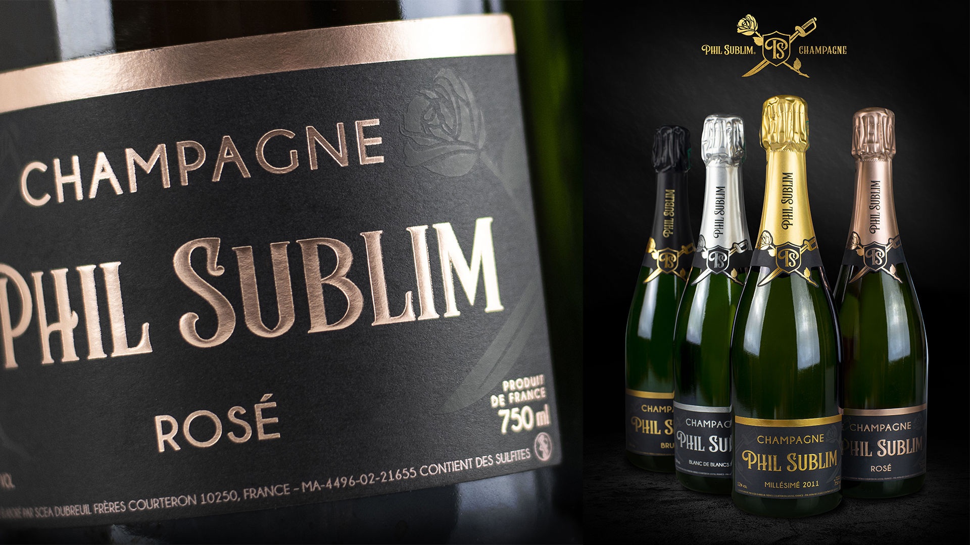
1. Phil Sublims‘s signatures are the rose and the sword. Two old symbols used to create a fresh, young brand.
2. The metallic colors, mixed with different printing techniques, give the packaging a true wow effect when combined with elegant black label material
3. The champagne’s unique packaging expresses the premium quality and intense perfumes well-rooted in the Côte des Bar terroir.
Creating a label design with a story
Unpredictable, elegant, and creative. These three words describe the new Phil Sublim Champagne, which has its roots deep in the ground of France’s hottest Champaign territory, the Côte des Bar. Here winemaking tradition has been refined over the centuries transforming the flavours, colours, and scents into Phil Sublim Champagne – a wine capable of expressing passion, delicacy, and quality.
When Mattia Generali, an expert creative designer based in Milan, Italy was asked to design the look for the new Phil Sublim Champagne, he was ready to accept the challenge. Maison de Champagne, the winery owner, was looking for a wine label design that would represent the young brand with high quality and strong personality. It was also important to create a connection between the design and the territory.
The base for Generali’s design was built around three elements: a saber, a rose, and the brand’s initials. He first created the saber to represent sabrage*, an ancient tradition of French soldiers celebrating victories by opening champagne bottles with their own saber. Then a rose was added to showcase the elegance, perfection, and delicacy of the champagne. Finally, Generali sealed the crossing saber and rose with a shield containing the initials of Phil Sublim.
The design describes the simplicity and value of a single gesture, from the collection of the first grape to the final sabrage.
Elegant black labels showcase the quality
In the wine market, the label has the utmost important role – maybe even bigger than the product itself. An eye-catching label can be the key differentiator when it comes to making an in-store decision.
To make Phil Sublim Champagne stand out in a crowd, Generali chose UPM Raflatac Dark Noir Premium-FSC label material for the bottle. Once the material was selected, the initial layout was created with advice from UPM Raflatac.
“Black label material delivers the message of a premium, high-quality product and that was the look we wanted to pursue,” Generali says. “The Dark Noir label material was the best partner to pair with the innovative graphics I designed. I also used foil application and silk screen printing for the labels.”
The end result, the Phil Sublim Champagne collection, with its stunning personality and design, was the result of a great collaboration between the designer, winery, UPM Raflatac, and the printer Grafical.
Learn more about UPM Raflatac's labeling solutions for wine, spirits and craft beverages