Keyboards were initially designed for mechanic typewriters, and those typewriters would jam if typed on too fast. DVORAK keyboards were designed to be much faster than QWERTY but jammed the mechanical typewriters and therefore lost their standing. As something becomes the status quo, it’s hard to change. This phenomenon is called path dependency.
At Kyrö, we want to break that path dependency in spirits packaging.
The reason why vodka looks like vodka, cognac looks like cognac and whisky looks like whisky when there’s often one company behind all of the spirits brands is due to path dependency. Big conglomerates have grown by acquiring new brands from new spirits categories. That’s why there’s Johnnie Walker whisky but no Johnnie Walker gin, cream liquor or absinth. Even though there indeed is one company that produces all of these.
For an upstart distillery like Kyrö, this poses amazing opportunity as well as a challenge. If we could build a brand around the distillery that makes a splash in multiple categories, we could become a loved and lasting brand for people even though their spirit of choice changes by time or occasion. If we promote gin with distillery first, people would know our distillery first whisky as well.
This poses a real challenge for label design. How can you build a label system where spirit categories would feel genuine, but you still would get the distillery’s brand first?
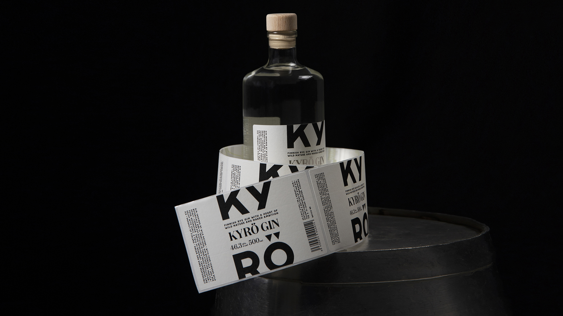
We teamed up with UPM Raflatac and Sense N Insight to find out. We researched how the materials and colors of the spirits labels affected the perceived quality, and this is how the distillery-first graphic design was perceived.
As a result, we ended up changing our gin’s name from Napue to Kyrö Gin but also ended up distinguishing spirit categories. That’s because there’s another principle worth knowing, the “MAYA” principle of Raymond Lowey, which stands for Most Advanced Yet Acceptable. According to our research and design, the MAYA of spirits packaging disruption is having one brand name but a design that honors the design tradition of each category.
That’s how you challenge the status quo. Will it work? We’ll see: our Kyrö Malt rye whisky is being released on August 15. Time will tell.