The origin story of rye spirit producer Kyrö is as quintessentially Finnish as you can get – except perhaps for one detail. A cold beer is the common beverage of choice for refreshment after a sauna bathing session – more so than the rye whisky that Kyrö’s five founding members were sipping when they decided to establish the company in 2012.
It used to be a tradition for Finnish business people to use the sauna as a venue for sealing deals. In the case of Kyrö, five friends went in for a relaxing steam and came out with a brilliant business concept. Today, Kyrö’s spirits are firmly established as a top Finnish brand, while the company has its sights set on an increasingly prominent European market profile.
“The idea was inspired when we wondered why there was no rye distillery in Finland,” says Mikko Koskinen, one of the Kyrö brand’s five ‘founding fathers.’ “All of us shared the dream of founding one and, in spite of our lack of experience, we were daring enough to pursue the dream. That enthusiasm has remained at the core of the distillery. We make different things – gin and whisky – from rye, because we want to stand out. It makes sense that they are made in Finland. We don’t want to make Scotch whisky in Finland, we want it to be Finnish, and we want to be local wherever we are, to source local materials and to be part of local communities.”
The company’s sustainable values are rooted in this focus on local priorities.
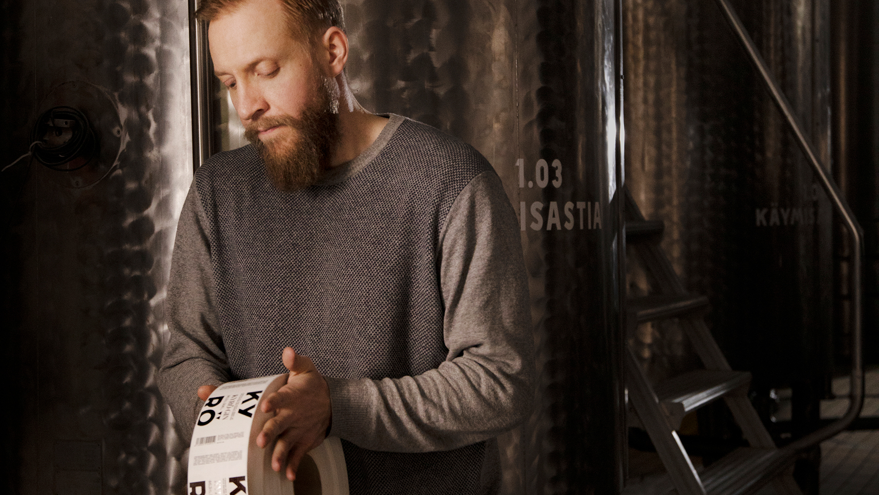
A down-to-earth sense of place – and a very Finnish sense of humour – underline the brand image. Kyrö is a reference to the village of Isokyrö on the flat agricultural plains of Ostrobothnia in western Finland where the distillery is located, and rye is a dominant crop for the expansive farms of the region. This rustic connected-to-nature theme is reflected humorously in the company’s promotional material and repeated in the products’ chunky bottles and packaging, and crucially, in the bold labelling.
Unpretentious enjoyment
Koskinen characterises Kyrö’s brand as “democratised premium” and the bottle labels are designed to convey this message to the consumer. “Although it’s not a cheap product, it shouldn’t require huge amounts of knowledge to be enjoyed,” he says. “It is accessible, but premium. The worlds of whisky and also of gin are sometimes complex, like the world of wine. We thought that we could make things easy, so everything we produce is made under the name Kyrö. That stands for the best ingredients, unpretentious enjoyment, and bringing people together at the same level. We provide the option of enjoying whisky, for example, without the hierarchy that often goes with it.”
A big difference between Kyrö’s approach and that of other, more established spirit brands is the inclusion of more than one product under a single brand umbrella – namely gins and whiskies. The identity was an almost instant success in its home market, but breaking through into international markets presented a challenge, not least because of this umbrella approach.
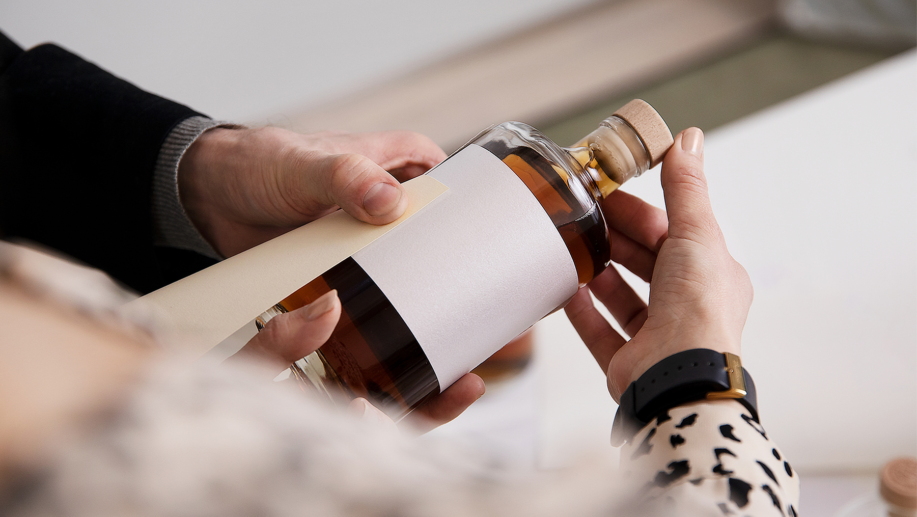
“We did some soul searching and saw that naming and labelling was rather complex,” says Koskinen. “It carried messages that are familiar in the domestic market but might be a bit difficult to understand anywhere else. That’s when we decided to do some consumer research into the labelling of the bottles and it’s why we have implemented the results of that research.”
The company turned to the Finnish research firm Sense N Insight for support in this process.
“Packaging is very significant as a marketing medium,” explains Virpi Korhonen, co-founder of Sense N Insight. “It can access places that other media cannot. Every product that is packaged must have a label by law, and that label must display certain information, especially for food, drink and medicine. With premium product labelling, the producer needs to consider how to optimise the product’s sales potential, and this means the consumer has to experience the value of the product. Designers and brand managers tend to think they know how customers feel about their product, but often they don’t because they are too close to the product and they don’t necessarily represent the typical consumer who buys that product.”
In Kyrö’s case, the aim was to study perceptions of labels for gin and whisky so that the optimal label design and material for each could be determined. Consumers of both gin and whisky were recruited from a large Helsinki mall and asked to take part in eye tracking, focus group interviews and sorting tests. These included choosing bottle label materials, varying in colour and paper type, from 12 samples for each product category in order of perceived quality and authenticity. It became clear that the bottle label materials perceived as premium quality for gin varied significantly from those for whisky.
Kyrö Distillery: The perfect label material for both gin and whisky
“We corrected misconceptions with a redesign,” says Koskinen. “It seems to have worked very well because we are now beating other traditional brands in terms of brand ‘top of mind.’”
Rooted in sustainable values
The collaboration with Sense N Insight emphasised the differences in perception of what is premium when it comes to different spirit categories. “The label material hadn’t been the best for cross-category labelling. We could have used different materials for different products but that would have taken away from the consistency of brand. The study helped us to make the kind of trade-offs that are very hard to make. It also underlined our values, of which sustainability is one.”
The label material chosen for the Kyrö brand is a product of UPM Raflatac, whose offering covers a wide range of innovative label materials. “The label is basically the face of the product and our aim is to help brands make themselves desirable and differentiate themselves,” says Matilda Rosti, Senior Marketing Manager. “The insights we can provide in label material selection are based on knowing the market and the needs.”
UPM Raflatac is leading the way in sustainable labeling, responding to the growing need and demand for sustainable packing solutions. The company also works closely with designers, helping them to identify the label materials that enable them to bring their visions to life.
“Design is the starting point for sustainable packaging,” says Rosti. “Our ecodesign approach guides us to select raw materials that reduce raw material needs, enable recyclability and provide renewable alternatives to fossils and lower environmental footprint over the lifecycle. The main goal of ecodesign is to promote circularity, as well as minimise the negative and maximise the positive environmental impacts of sourcing raw material, manufacturing, logistics and the use and disposal of products.”
The rougher, matte feel of Kyrö’s redesigned labels is one aspect of a holistic brand message supporting sustainability as a value. Koskinen understands that claiming to be sustainable is not enough in itself and that Kyrö has to “walk the talk.”
“Our labels are made in Finland in accordance with the highest standards with local materials, and we can easily assess effects on the environment. We source local rye and the more we grow the more we can have an effect on sustainable farming practices. We use biogas in our distillation. So sustainability is an underlying quality,” he says.