In this article you will learn about:
When you enter a wine store to purchase a bottle of wine, you fall into one of two wine consumer categories based on how you decide which bottle to buy. You might be a well-informed wine consumer, with deeper technical knowledge of what kinds of factors contribute to a bottle of great wine. Making your way around the shelves stacked with different options is not an issue, as you have a clear image of your options and the kind of wine you’re looking for.
Most wine consumers, however, fall into the second category – those with very little knowledge about wine. Many do not know how to make a qualitative distinction between different grape varieties and are unfamiliar with the effects and value of other intrinsic factors such as the winemaking process, or the vintage.
If we then take this average wine consumer and remove the price, external factors, such as the bottle, closure, and label, become the predominant factor in the decision-making process*1&2. The label’s role becomes substantial – it is the primary method of persuasion. The bottle and the label must be able to facilitate the purchase of the bottle by attracting, communicating, persuading, and reassuring the consumer.
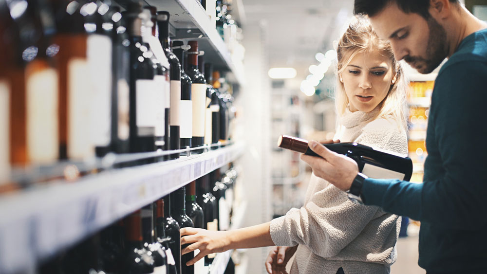
Consumers form an impression and judgment on the wine based specifically on the aesthetic evaluation of the packaging and label, and how well the bottle stands out from its surrounding competitors*3&4. Wine label design that can stand out and instantly catch the consumer’s eye increases the chance of a bottle being spotted first, and as a consequence, considered and purchased*6. Wine label design, therefore, plays an extremely crucial role in selling the first bottle of wine.
For a deeper understanding of how paper and embellishments influence wine purchase decisions and how consumers interact with wine labels, we recommend you to download our wine label Neuromarketing study, developed exclusively by UPM Raflatac’s wine labeling experts.
Portraying your brand identity through wine label design
Buyers with limited wine knowledge lack the capability to adequately perform a qualitative evaluation and choice, relying heavily on the perception that the label and the bottle convey*7. Furthermore, the choice of wine tends to be a purchase that is strongly influenced by the wine consumer’s perception of their own identity or a group the consumer wishes to belong to. This brings a new dimension to the importance of conveying the symbolic narrative and wine brand identity through wine label design. Some researchers even claim that the perceived quality of wine can be influenced by changing the external design characteristics of the bottle, without any additional changes in the wine itself*6.
You truly need to know your wine brand, what is the target audience, and what kind of wine label design intrigues the interest of your target audience. A traditional vineyard with a long heritage might want to appeal to the consumer by demonstrating the expertise that has been passed down through generations, emphasizing the trustworthiness of choice. An upstart winemaker might aim to intrigue the customer with a more modern take on the wine label design, standing out as an adventurous choice. The key is to have a clear focus and to consider how wine label design can attract your key audience.
Wine label color
It has been proven that changing the color or other visual elements of the wine bottle can influence the perceived taste and the aroma*7. The color of the bottle and label should therefore enhance and reinforce the characteristics of the wine.
Typical wine bottle and wine label colors
The colors of wine bottles usually follow standard industry protocols: red wines use dark bottles to protect the wine from sunlight and oxidization, while white wines use clear or pale green bottles. As the wine bottle colors are fairly standard, creativity in illustrating the wine brand and standing out through skillful usage of color in the wine label design becomes key.
To provide a point of reference, let’s look at popular color schemes. Red wine labels have two popular approaches: strong use of dark colors, creating a moody feel, or a white label with powerful colors that stand out, such as deep reds, blues, or golds.
White wine labels tend to go for lighter colors. Usually, this includes a white or light-colored background paired with light blues or greens, which are often associated with sensations such as crisp or fresh. For rosé or sparkling wine bottles whites, golds, and pinks tend to be the predominant choice of color.
Which wine label colors should you choose?
While wine label design typically follow certain color schemes, it doesn’t mean you should follow the trend. Something unexpected is more likely to stand out from the competition since it is decoded immediately by our brain as something “different” and unanticipated*7. To take a deeper look into what aspects you should consider when choosing your wine label colors, let’s look at the insights past consumer studies provide us.
In a study that analyzed consumers’ interaction with red wine bottles, it was proven that labels with strong color contrasts are more prone to attracting consumers’ attention*7. In practice, this might mean using black and white, or black and red for example.
In another study executed with red wine labels, scientists discovered that the background color of the label influences consumers’ choice of wine, and that consumers seemed to associate different colors with different flavors*8. Consumers who were looking for a wine with more of a full-bodied flavor chose wines with red labels, whereas those in favor of a more floral taste chose wines with orange labels.
The study revealed that on red wine bottles, black wine labels were associated with dry, earthy, or woody flavors; red with tangy; and orange with flowery flavors*8. White labels were associated with milky tastes, and blue labels were neutral. Utilizing these colors to reinforce the dominant red wine flavor might generate good results in enhancing the drinking experience.
Wine label style
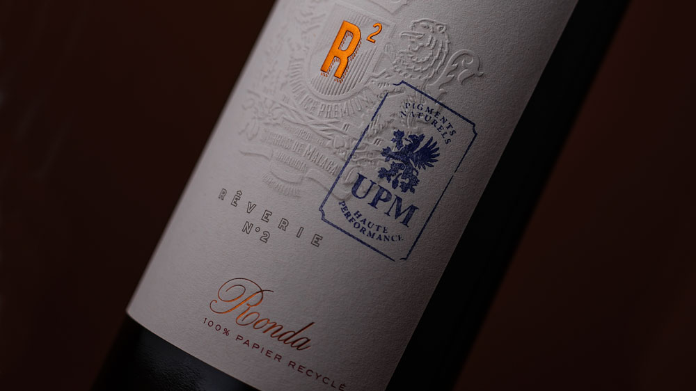
Your wine label style should match your brand identity and your core audience. Examples of styles you could aim for include contemporary, minimalist, elegant, or traditional label style. Wine label styles are created by skillfully combining typography, imagery, and the chosen finishes.
The wine label design must be able to catch the wine shopper’s attention and stand out from the other labels. Adapting original graphics that somehow are out of the ordinary, by utilizing layout, colors, paper, or finishes, becomes vital.
Wine label imagery
Imagery plays a great role in creating a wine label style. When imagining typical wine label imagery, many of us probably visualize a pencil drawing of a vineyard villa. Today, wine shelves are colorful with different contemporary takes on wine label imagery – cartoon-like drawings, minimalist logos with a lot of whitespace, watercolor art, bold typography that covers the whole label, labels that draw on humor, and more.
With style and imagery, you need to rely on the wine brand identity and the aspect that makes this wine different from others. Are you aiming for a high quality and price point, but with a modern twist? Maybe choose something cool and minimalist. Is there something special about the winery or the vineyard, such as the location, the name, or the animals? Is the wine meant to be enjoyed with a certain food or in a certain situation? Maybe illustrate those using a unique technique or style. Or perhaps you want to choose something that’s meaningful for the owner of the winery, such as their child’s favorite toy or imagery from their favorite folk tale, maybe it’s even a drawing of the owner themselves!
Using unique imagery allows you to stand out and be remembered, so be sure to put effort into finding your perfect wine label ideas!
Wine label typography
Like imagery, your font needs to match the style and the wine brand image. Wine label designs with a traditional style often go for busier font styles, relying on serifed typeface. Wine labels that go for a more modern, contemporary touch, might use bold sans serif faces or alternatively something very minimalistic and simple.
Think about the balance between imagery and typography. Do you want both to have the same prominence on the label? Should the text be the dominant eye-catching element or vice versa? Regardless of which approach you choose, remember that the text needs to have a strong contrast to the label in order to stand out.
Wine label finishes
Label finishes can make a significant difference in standing out. Carefully thought-out finishes illustrate attention to detail and reinforce the brand image.
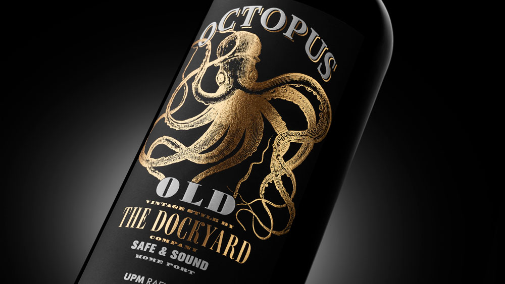
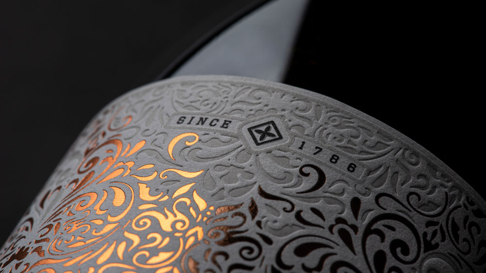
In a study that analyzed consumers’ interaction with red wine bottles, it was proven that wine label designs with glossy finishes perform better than non-glossy ones, especially when contrasted with a matte background*7. Red wine labels that had an embossed, glossy finish had the best performance, as they created a feeling of greater attention to detail.
It should also be noted that as consumers proceed to further examine the label of the bottles that have sparked their interest, finishes that are particularly pleasing to the touch improve the overall perception of the wine and increase the intention to purchase*7. Some combinations of paper and finish have been proven to be especially effective in attracting emotional involvement. Glossy, embossed finishes combined with textured paper were perceived to be especially luxurious, increasing the price that consumers were willing to pay for the wine.
Wine label material
As already briefly discussed in the finishes section, touch plays an important role in the decision-making process after sight. Finishes that are particularly pleasing to the touch improve the overall perception of the wine and increase the intention to purchase*7. But another aspect to note is that the sensations experienced through sight and touch should enhance each other, confirming, or even exceeding the expectations the wine consumer establishes while interacting and observing the bottle of wine.
When a wine label is pleasing to the eye but disappointing or not pleasant to the touch, it can have a negative impact on a crucial part of the decision-making process, even resulting in a missed purchase*7. The effect is the same when based on sight, the consumer expects a certain type of texture, but upon touching the material, the sensation doesn’t match the expectation. These claims are supported by other consumer behavior studies as well – “if the hand’s judgment is unfavorable, the most attractive object will not gain the popularity it deserves”*9. Furthermore, stimulating multiple senses doesn’t only affect the purchase intention, but also helps consumers to
remember the product*10.
Being aware of the challenges wine label designers and brand owners have in choosing a material that matches their vision, we have created a tool especially tailored to help wine label designers and brand owners choose the perfect label material to match their designs. Utilizing our Digital wine, spirits and beverage label material swatchbook allows you to explore a vast range of wine, spirits, and beverage label materials, and bring your designs to life by using HD images of the chosen label material in your design software.
Wine label paper
The first phase of the wine selection process – Vision
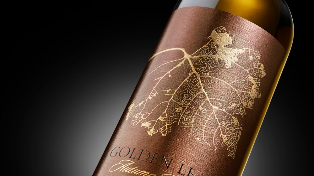
When a consumer first scans the shelf, the paper type appears to have a significant role in helping a wine bottle to stand out*7. When it comes to red wine bottles, matte, dark, and textured paper captures the attention of a wine shopper in an instant, and is able to hold the consumer’s attention for longer than other types of wine label materials on average*7.
Especially visual contrasts, such as a combination of dark, matte, and textured wine label paper paired with embossed, gold, or glossy finishes have the power to endorse the selection of a wine bottle in the first phase*7.
The second phase of the wine selection process – Touch
When the wine shopper interacts with the label by touching it and examining it closer, the wine label paper plays an even greater role. Our fingertips are extremely sensitive to different textures and consistencies.
The wine label material has a significant influence on the level of emotional involvement, on the perception of the label, and finally, on the intention to purchase*7. According to research, wine label papers that are more textured lead to stronger emotional engagement and a higher intention to purchase*7. Wine labels appear to perform better when the label paper has a raised or rough texture that stimulates nerve endings located in our fingertips*7.
Similar to the first phase, tactile contrasts – rough, textured paper paired with smooth details or finishes – appear to be clear winners in endorsing the selection of the wine bottle. However, a matte, non-glossy base label paper seems to always perform better, suggesting that the contrast should not be reversed.
Download our wine label Neuromarketing study for deeper insights into how wine consumers interact with wine label materials.
Wine label design matters – make it count
Wine producers today are increasingly aware of the significance of wine label design. They rely on the creativity and expertise of wine label designers to convey the values and story of the wine brand, and to help consumers correctly predict the wine tasting experience.
The wine label and packaging, in addition to guiding choice, affect the perception and evaluation of the quality of the product itself, not only before but also after tasting the wine*11. The label must then be able to reassure the wine consumer of the choice of wine, confirming that the wine is suitable for the situation that it was bought for.

Wine label design, combined with the correct wine label materials and finishes has the potential to make an immense difference in the success of a wine. As a wine label designer or wine brand owner, you are responsible for harnessing that power correctly. Utilize our Digital wine, spirits, and beverage label material swatchbook tailored to help wine label designers and brand owners choose the perfect label material and to make a difference with details that matter.